The Color of the Year
Every year, Pantone chooses a color of the year. Their decision is a deliberate, calculated, symbolic snapshot of what is occurring culturally around the world. It’s decided upon by the Pantone Color Institute’s panel of experts in the areas of entertainment and fashion, and is intended to both reflect and influence trends in product, home design, and fashion. The executive director at Pantone, Leatrice Eiseman, notes that the color of the year “has to resonate around the world, to express in color what is taking place in the global zeitgeist.” This year, that color is: Greenery. While Pantone takes a holistic approach to determining their color of the year, influencing both interiors and fashion industries, paint brands like Benjamin Moore and Sherwin Williams have been known to choose their own official hues of the year as well focusing, of course, on wall colors first. Their selections however, often seep into the world of fashion as well.
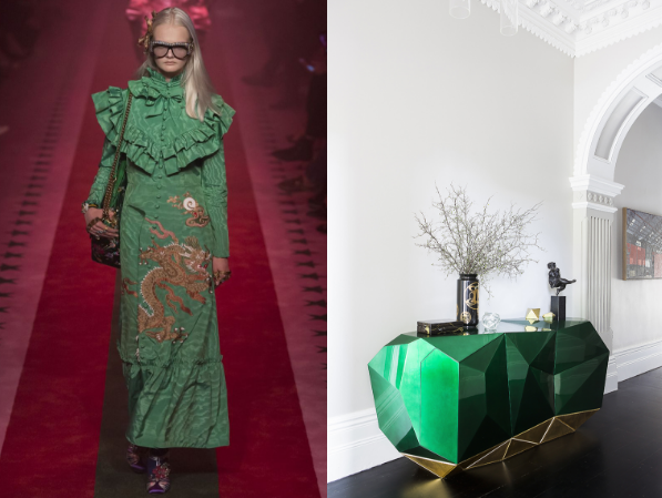
Verment Couture Gown, Brendan Wong Design (Boco de Lobo console)
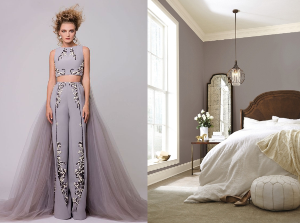
Pantone: Greenery, A Symbol of New Beginnings
This energetic, optimistic hue has already made its way into use as an earthy accent, and is more complimentary and versatile that you might initially think. There has been a shift towards bringing the outdoors inside in the home furnishings industry, and being sustainable and shopping consciously in wearable fashion. Greenery has grown in popularity in the world of high-fashion and in environmentally-conscious homes. Here are some ways in which greenery has been integrated into interiors and fashion:
Pairs Well With: Browns, Black, Gold, Orange, Pink
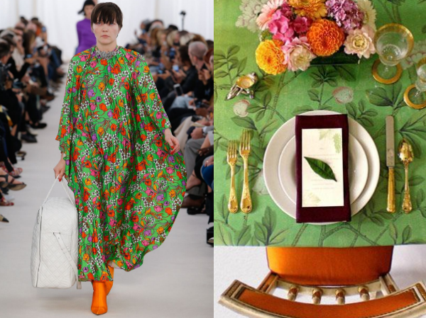
Michael Kors, The English Room Table Setting
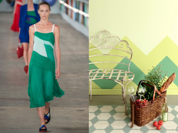
Balmain Gown, Color House via This Old House
If you like what you read here, be sure to subscribe.
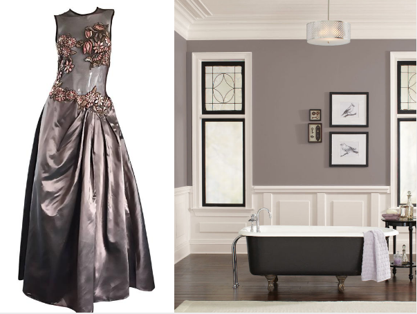
Benjamin Moore: Shadow
Benjamin Moore’s moody selection for color of the year is all about ambiance. Shadow’s richness has already emerged as a glamorous red-carpet favorite in the fashion world. In residential design, it’s predicted to be a popular selection for dinning rooms, home studies, libraries, and romantic bedroom spaces. It’s also popular choice for accents and trims, or in dramatic, commercial projects like restaurants and hotels.
Pairs well with: Gold, Pink, Taupe, Greens, Blues
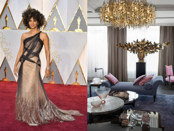
Halle Berry Oscars Gown, Kate Hume: Penthouse Design
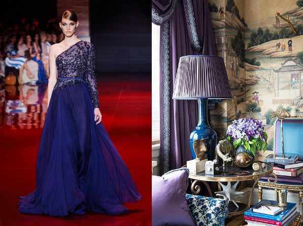
Ellie Saab Haute Couture Gown, Alex Papachristidis’ Home
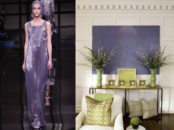
Armani Prive, Interior: Decor Pad
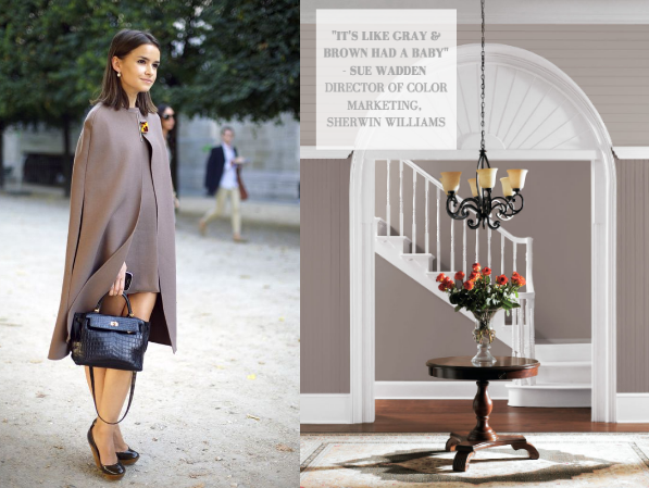
Sherwin Williams: Poised Taupe
Sherwin Williams, op’t for a safe neutral selection for their Color of the Year selection. Poised Taupe is a clean compromise for those who are tired of the all-white, and now, the gray-everywhere color trends of the last couple of years, but are not eager to return to beige. Poised Taupe is a warmer selection than each of its popular neutral predecessors. It’s versatile: both coastal and rural. It’s anticipated to emerge as a favorite in east coast nautical and traditional or contemporary interiors. In fashion, poised taupe recalls a classic nostalgia and can be found in vintage-style gowns, and in contemporary couture wedding gowns. It was chosen as the emergence of the Danish “hygge,” (which loosely translates to “cozy”) interior trend has made it’s mark across the globe: neutral, warm, and comfortable.
Pairs Well With: Warm Tones, White & Beige, Charcoal
Miroslava Duma in Lanvin Cape. Miroslava Duma, daughter of Vasilay Duma, a Russian senator + editor for Harper’s Bazaar.
Azzi and Osta Couture Wedding
Halle Berry Vintage Ellie Saab Oscar Gown via 1st Dibs, Sherwin Williams Poised Taupe
A Brief History of Color Forecasting
Color forecasting originated from the first French fashion houses of the 1800s, predating photogenic color. The houses created swatch books, including decks of cards demonstrating how particular hues would look on different materials. The emergence of these decks created a larger market of bespoke fashion consumers who could shop colors and materials from these decks, and didn’t have to be in the shop, in person. The palettes included in the decks would indicate that year’s colors and materials, which complimented each other, and an additional deck would be released the same year with slight changes in tone, to indicate the changing of seasons.
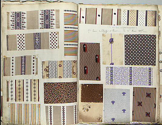
Color Swatch Book
This was made possible only as chemists and biologists discovered ways of reproducing color in large batches, largely dependent upon changes in climate, and what crops used to create dyes looked like that year. Thus, these selections are not arbitrary or random, but are dependent upon natural occurrences. They are drivers of the economics of both fashion and home decor industries.
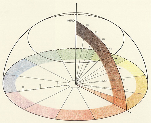
French chemist, and color expert, M.E. Chevreul, was tasked with creating dyes for the purpose of designing wall tapestries. When he invented the Chromatic Circles, describing relationships between colors, he didn’t know he would be setting the precedent for the color wheel as we know it today. The color tool demonstrates the relationships between colors on a wheel. It’s a visual aid so simple, it can be taught in primary schools. In addition to being an educational tool, it serves the economic demand created by the color decks of the fashion houses, by ensuring accuracy in hues during reproduction, as in fashion or home goods.
If you like what you read here, be sure to subscribe. And for further reading on Color Forecasting, we recommend The Color Revolution by Regina Lee Blaszczyk.